Building a (Better) Book Student Project Demos
I’m publishing this here as a way to gather these materials for inclusion in the July 2nd edition of the Northeastern English Department newsletter. If you’d like to stay informed about the amazing work happening in our department, you can subscribe to the newsletter for regular updates!
This summer I got to teach one of my favorite new classes, the honors seminar “Building a (Better) Book” (BBB). This course was originally designed after the founding of Huskiana Letterpress Studio in January 2019 and is a studio course centered around original book projects that students conceive, develop, workshop, and create over the course of the semester. Here’s how I describe this central project in the class syllabus:
The central work of this class will be an original book project you will conceive, develop, and produce over the course of the semester. As we will see in our readings and other investigations, the word “book” can mean many things. Your projects can likewise take many forms and include a range of media: e.g. a letterpress chapbook, a zine, an altered book, an interactive digital book, or something else. I strongly encourage you to develop a book project that blends at least two of the media we will discuss together, but you could do more, and you might choose to use a medium we do not cover in class. The content of your book will be entirely up to you. You might draw on your home discipline, a favorite hobby, or a cultural interest, among other possibilities.
BBB students develop these projects through three stages: proposal, prototype, and final project, which they present during the final days of class.
In the original version of the class, some students used Huskiana press for aspects of their projects and all students benefited from our in-class studio sessions. The coronavirus pandemic forced the Summer I session of BBB to work remotely, which introduced new challenges, particularly for a studio-based class. We had to focus on the book technologies we could experience together at a distance—such as making zines or binding pamphlet-style notebooks—and those that translated well to a digital paradigm—such as building interactive narratives in Twine. Despite the obstacles presented by asynchronous workshops and Zoom studio groups, my summer students produced innovative, thoughtful, inspiring final projects
I am pleased to share a few of these with the English Department, with their creators’ permission. In most cases, I will share the video presentations that students made to the class during our final synchronous meetings, in which they outline the content, structure, and impetus behind their book projects. As you’ll see, students in this class approach “the book” from a wide range of perspectives, and their projects vary widely. Some seek to press against the formal boundaries of what we call a book, which others work within established bookish traditions. Some present original content, while others remediate existing materials in order to provoke ideas or reactions from readers.
Each student paired their project with an artist’s statement that will:
help readers/users understand the theories of the book your project seeks to instantiate, the methods and materials you used in producing your book, and any habits of reading required to fully understand your book project. In short, your statement should summarize the intellectual work of your semester so that the labor of your project—both physical and mental—is clear.”
I won’t reproduce all the students’ artist statements here, and in many cases their presentations overview the intellectual claims and creative interventions of their projects. However, I did want to include one example statement, with the student’s permission, to give a sense of the intellectual work students do in these projects throughout the semester.
Rayyan
Rayyan volunteered his statement for this newsletter, and so I include his video presentation, followed by selections from his written artist’s statement. Rayyan completed a diminutive project, in physical scale through not in intellectual heft, that sought to interrogate ideas of space in the codex form. I will let him explain what that means!
This piece is formally titled 82080: A Map of Urban America / A Map of Middle America.
Abstract: The miniature codex you see aims to remark on contrasts of size and dimension as they relate to form and content of books. The idea was derived from a concept examined throughout our class: the book as a space-time sequence. Rather than use words which abstract for thought to deliver meaning, snippets of a road atlas form the pages of my book which abstract for physical space. In the book’s entirety are an accumulated 82,080 square miles of geo-spatial representation, all of which fit onto 2-inch by 2-inch pages no larger than the palm of a hand.
Themes and Meanings: Is the book big or small? How much space (literally) does the content of a book need to convey itself? Does this affect its perception? What makes content feel its size?
These are some of the central questions which drove my choices in creating the book and accentuating the cognitive dissonance which it may arouse. Repurposing the pages of a map played perfectly for this role because of the stimulating visual content and the difference in the way it is read. Words on a map are meant to conjure spatial imagery and are more explicitly symbolic than words in traditional prose or literature. Sometimes the bolded name of an urban city on the page was larger in text than entire Indian Reservations in Minnesota. If the word “Los Angeles” itself reads larger on the page than the physical representation of the Red Lake Indian Reservation, then how does this alter how it should be read? In reality, the Red Lake Indian Reservation is double the size of Los Angeles. If words can mislead in this way, is this a limitation of textual representation when abstracted for space?
[…]
Instructions: Finally, I would invite any reader to peruse the pages as they prefer, observing the more known and not-so-known places in America, and enjoying the visually vibrant content of the map pages. You could even read the book backwards if you like. I would also ask the reader to try and reconcile some of the differences they see and feel with such a high-level reading of physical space, and ponder about what place the words they read have in their experience of this small book.
Emily
The final book project in BBB encourages students to dive into subjects that interest them; their contents don’t have to be literary. Emily was interested in the history of women’s fashion and its relationship to movements toward gender equality, and explored that topic through a book with interactive elements that elucidate the material (pun intended) she discusses:
Levon
In BBB we explore both analog and digital books, and in this Summer I session we spent even more time that usual discussion electronic literature, a thriving genre that borders on gaming. Levon decided to explore his own discipline, biology, and create an interactive, educational book for kids. I can testify that my eight-year-old was a huge fan, so this book definitely addresses its target demographic:
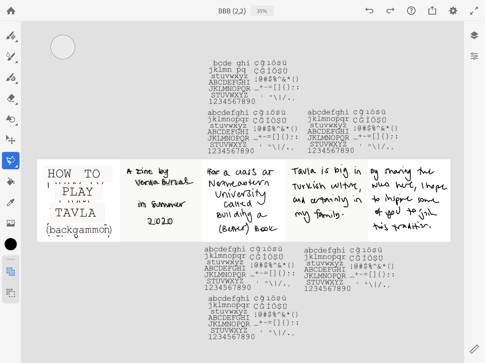
Verda
Verda explored another perspective on electronic literature, thinking about how the humor, personalization, and introspection of zine culture translates to social media. The recording of her presentation had some problems, so instead I excerpt a bit from her artist’s statement and include a link to her Instagram feed, where you’ll find her zine (intermingled, intentionally, with other content). Verda notes that, per the platform she used, this book is best viewed on a mobile device.
I’m a big zine fan, and I love stretching my definition of things I take for granted (this semester, that thing has been a book.) In our synchronous class about zines, it dawned on me that Instagram might be an evolution of zines: it’s a platform for short-form, self-published (and thus free and mostly democratic) mixed-media content-sharing with a following of people. I’m accustomed to zines being folded like pamphlets, but the zine lab brought to my attention that there are more creative ways of folding paper zines, so that certain information appears or certain images come together depending on how you fold the paper. Naturally, I wanted to explore the Instagram version of zine-folding, and further just explore the affordances of the Instagram medium.
For the content, the biggest thing that draws zine culture to me is that it’s an exploration and annunciation of one’s identity, so I wrote about tavla. I grew up playing tavla with my mom, my grandparents, my family friends, and even people I had just met in Istanbul. (I didn’t actually live in Istanbul growing up; my family would just go there every summer.) My Turkish heritage is extremely important to me, and tavla is one of the traditions I’ve been able to hang onto the best, having grown up in the States with no close Turkish friends with whom to share my culture.
Crafting the zine consisted of sketching out the words and drawings, coming up with a “font”, creating the polished drawings, collaging the text together from the “font”, and a lot of copying and pasting layers around different Adobe Fresco documents. (I did the whole thing in Adobe Fresco on my iPad.) I picked the color scheme from colors found in a picture I took on my phone of myself and my mom playing tavla, with a cup of tea in my hand. Because of the pixel size limits on Fresco documents, each of the 9 posts in the zine came from 1 or 2 Fresco documents (1 if 5 or fewer images in the post, 2 if more than 5)
[…]
The “font” started out as a few images I found on the internet containing Courier New characters. I had to use a few different ones because I couldn’t find any with my Turkish characters as well as punctuation and numbers and upper and lowercase letters. Once I had those images correctly sized relative to each other, I made a new layer and traced over them with a vector brush for cleaner lines (and more of a homemade shape to the characters.) I duplicated this layer and resized it for different font sizes, and I copied those layers between all of the aggregate image documents. In each aggregate image document, I picked the layer with the font size I wanted, and duplicated it several times to get several copies of each character. Then, I would painstakingly zoom in, lasso each character, zoom out, and transform it to where it needed to be based on my sketches. When I ran out of any characters, I would erase all of the unused characters from my duplicate layers, and bring out a fresh set of duplicate “font” layers to keep the text going.
[…]
Here’s where the whole project can be found (note: this is indeed just a link to my Instagram profile; I’m not linking to any particular post because the “entry” to the zine, so to speak, is the view from the profile page. It’s best viewed on mobile, but I think desktop or tablet gets the point well enough across):
Minji
(Content warning: eating disorders) Minji’s book took on a deeply personal topic in an inventive, informative way. When I doubled-checked with her that she was comfortable sharing this project, Minji wrote, “Hopefully this project can help those who are struggling with similar issues and can give assurance that they’re not alone!”
Isabel and Christina
With students attending class from home and largely confined to their local neighborhoods, it’s perhaps no surprise that many chose the pandemic and/or family life as organizing themes in their projects. Students created family cookbooks, quaran-zines, and more. Both Isabel and Christina chose to focus on their local flora, creating beautiful and expressive books that wove together—sometimes quite literally, as you’ll see in Christina’s presentation—pressed plants, text—some handwritten, some printed, some typed—and other materials to create textured and interactive books that embody our strange current moment while speaking about the natural spaces that interweave with these students’ local communities.
Conclusions
I hope these presentations give a flavor of the work that students do in “Building a (Better) Book.” I am so grateful to each of them for begin willing to share their work with the department. I also can’t wait to be back together in person, welcoming you all again to community print events and classes at Huskiana. In the meantime, however, it was heartening to see the kinds of bookish experiments and community we can cultivate in community, even when working from afar. Here’s to Northeastern’s brilliant students!